
Introduction
This document will explain and display some issues in LinkedIn UI for the mobile app from Khaled’s point of view, the problems might differ from user to another user, but I tried to ask a friend about his experience and problems faced when using the LinkedIn mobile app.
The target was to improve the design not to create a new design, I did that because LinkedIn already has more than 830M members and creating a new design will make the users inconvenience.
●. ● ●
Linked Mission
The mission of LinkedIn: connect the world’s professionals to make them more productive and successful.
It is very useful to know the company mission to know their target users, and improve the UX based on that.
●. ● ●
Assumptions
After knowing the mission I assumed:
•LinkedIn is dealing with professionals
•The tech knowledge and education level is high
•The app depends on the users feeds and sharing their experience with each other
•The tech knowledge and education level is high
•The app depends on the users feeds and sharing their experience with each other
●. ● ●
Problems
•There is no recent feeds on mobile view, all my feeds in my home page are 2 weeks ago 😅
•There is distraction between reposted posts and liked posts (There is no difference between them)
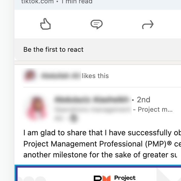
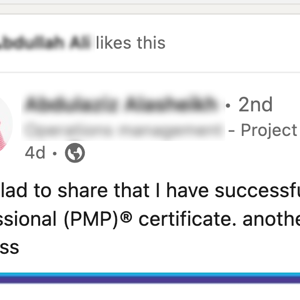
•There are special characters after each name in the home page (1st, 2nd and 3rd) it is hard to figure what is the purpose of it!
•Language problems
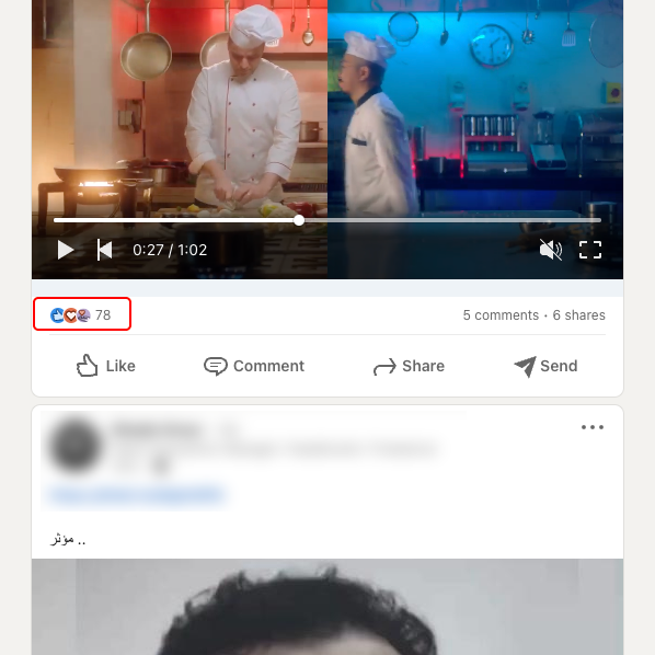
•Emojis does not show what is clearly mean in the home screen
•There is distraction between reposted posts and liked posts (There is no difference between them)
•There are special characters after each name in the home page (1st, 2nd and 3rd) it is hard to figure what is the purpose of it!
•Language problems
•Emojis does not show what is clearly mean in the home screen
●. ● ●
Possible Solutions
•Adding a button to change the feeds from top to recent
•Give a special view for liked posts and reposted posts
•Adding a clear symbol to the "degree of connection with this person"
•Instead of using ("share" will use "repost") and ("send" will use "share")
•Using a clear icons to display emojis
•Give a special view for liked posts and reposted posts
•Adding a clear symbol to the "degree of connection with this person"
•Instead of using ("share" will use "repost") and ("send" will use "share")
•Using a clear icons to display emojis
●. ● ●
Prototype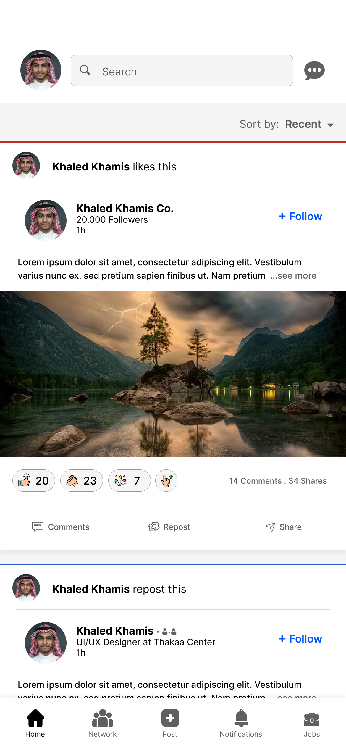
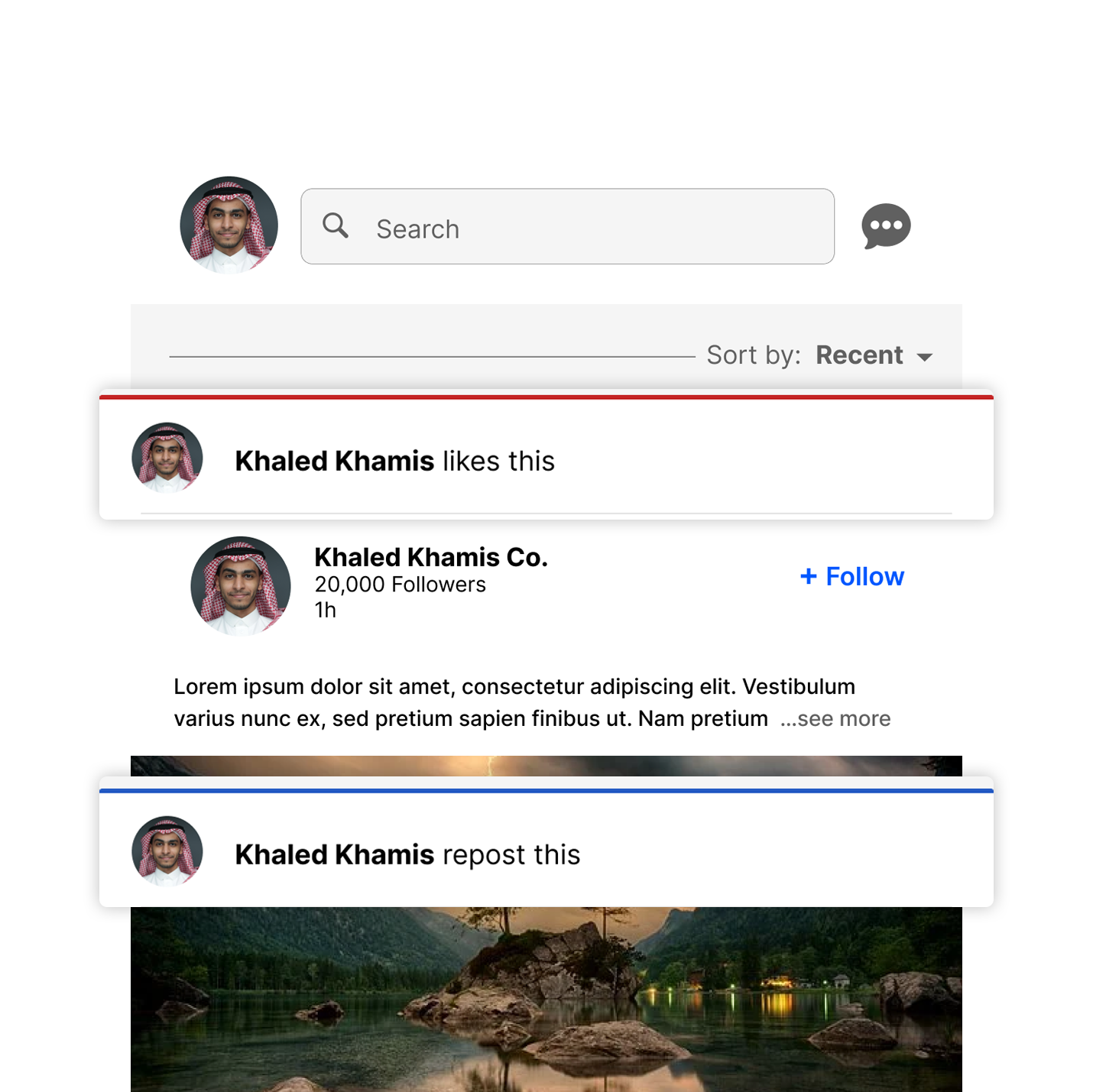
Suggested Home Page Design
Details
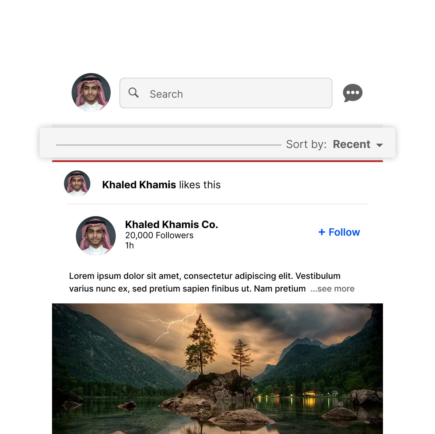
•Add Recent feed option (like the web app design)
Screenshot from LinkedIn website
Suggested Design
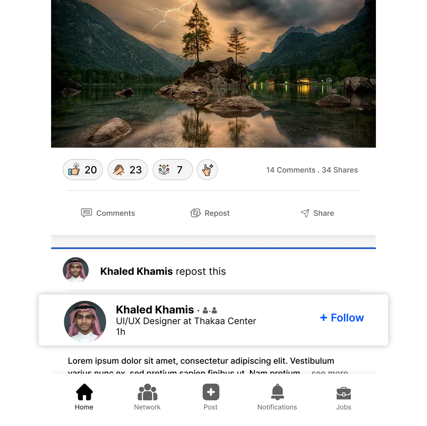
•Adding color coding line to differentiate between (Repost, like, love, … etc)
Screenshot from LinkedIn mobile app
Suggested Design
•Use clear icons instead of (1st, 2nd and 3rd)
Screenshot from LinkedIn mobile app
Suggested Design
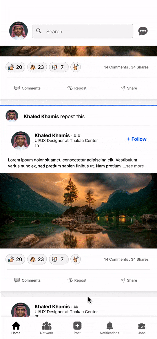
•Change the interaction buttons
Screenshot from LinkedIn mobile app

Suggested Design
•Remove like button
•Change “Share” button to “Repost” and when you click it you will have two options (Repost and Repost with comment)
•Change “Send” button to “Share” and when you click it you will have the ability to share it whether in the private messages or copy the link
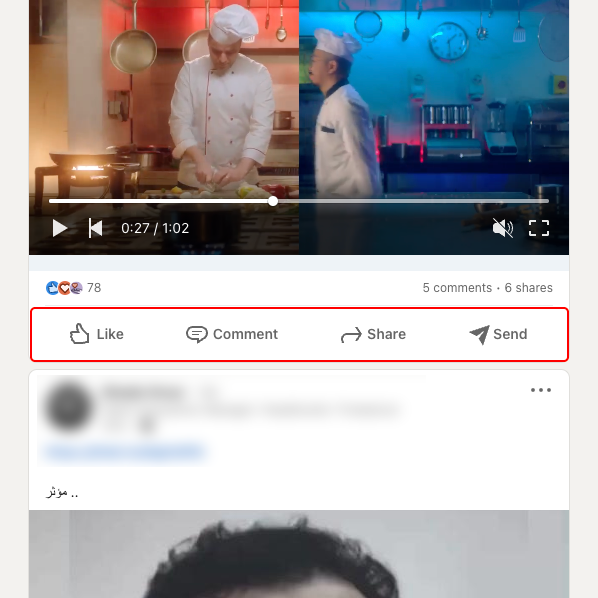
Screenshot from LinkedIn mobile app
Suggested Design
Thank You!
This document is a suggestion for LinkedIn, and showing some of my UX skills, I hope you enjoyed reading it 😁